Is Your Brand Helping Or Hindering Your Digital Marketing?
Disclaimer: This is a guest post, and the views and opinions conveyed belong solely to the author(s). There are a few reinterpretations of some popular brand logos, which are just reinterpretations and shouldn’t be taken out of context.
Have you ever wondered if your digital marketing is being held back by poor branding? As your potential customers whizz through digital content, attention is at a premium – your brand must make an impact, fast.
Here’s a closer look at why branding can make or break your digital marketing activities and how you can get your branding up to speed.
Why Branding Is Important for Digital Marketing
Your branding plays a pivotal role in determining how your business and products are perceived by your customers. It’s common knowledge that a strong and recognizable brand makes marketing much easier and effective.
Think, for example, how marketing collaterals from companies like Apple and Nike are instantly recognizable. This is thanks to the strong brand that those companies have carefully cultivated over the years.
Those brands perform brilliantly in the digital space too. And this is becoming increasingly important.
By now, we are all aware of the dramatic shift that has taken place in the world of marketing over the past decade: as budget allocation to traditional channels continue to dwindle, digital marketing budgets have never been so high.
Brands must appear where their potential customers are, and this means appearing online. Google alone boasts a staggering 63,000 searches every second of the day, so the battle for digital dominance is a fierce one.
As of 2016, mobile traffic officially overtook desktop traffic. Your potential customers scroll and swipe at breakneck speed, so your brand must be able to leap from the screen the second that it appears.
How Brands Stand Out Online
How exactly do brands manage to stand out online? They create a strong branding and extend it flawlessly into the digital world.
Quickly cast your eye over these early banner ads from Apple.
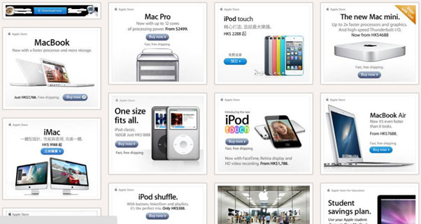
In just a millisecond, you know who these ads are coming from and what they are advertising. This is due to the power of strong branding and an intelligent transition to the digital space.
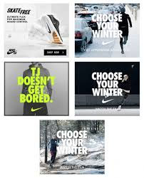
Look at how Nike manages to achieve the same:
Here’s a closer look at the key ways these top brands invoke their brand in the digital space.
Font
If you look at these examples again, you’ll probably find that the font is even more prominent than the images at first glance. Obviously, these organizations have spent a lot of time and resources to cultivate powerful brands that make their fonts instantly recognizable, and you should attempt the same.
It’s important that your digital collaterals coincide with your website and any print materials. Consistency is the key to strengthening your brand and making an immediate impact as your potential customer quickly scrolls through a page.
Imagery
The Apple banner ads use consistent product imagery and, in most cases, those images take up the majority of the space. These small choices help to build consistency and present the Apple brand within the digital space.
Nike invests an incredible amount of money and effort into its photography and graphic design. So much so that the brand can often by recognised by its images alone. You should work alongside your designers and marketing team to cultivate a distinct style and stick to it. Too many businesses make the mistake of using poor-quality and disparate images.
Copy
Digital marketing is incredibly unforgiving: you only have milliseconds to make an impact on your audience and you have to make it count. Look at how sparse and direct the copy is in both of the examples above. Despite the brevity, the copy still helps to push the brand voice.
The Nike ads are a great example of this. Concise and declarative sentences are a part of Nike’s identity, invoking a feeling of action and speed. Take the time to think about how your digital marketing copy can reflect your brand and build a consistent feel.
Location
Another important factor that can affect your brand in the digital space is placement. Brand safety has become a big talking point in recent years, and brands want to ensure that their messages appear within an appropriate environment.
You should think carefully about how to execute your campaigns to ensure that your brand is only ever presented in the best light. If your brand appears alongside unsafe and inappropriate content, irreparable damage can be dealt to your brand.
Giving Your Brand the Apple Treatment
Here at Heue Digital, we are big fans of Apple. (In the world of branding and marketing, who isn’t?!) We particularly love that the company has such an impeccable understanding of how tiny design choices can have dramatic impacts on how its brand is perceived.
We believe that this is an important lesson we can all learn a lot from, and we draw a lot of inspiration from it when we work with our clients. When we launch a new branding initiative with our clients, we work to give them the “Apple Treatment”. This means we take a look at every possible way that the brand will be presented and refine it as much as possible.
We had a lot of fun recently imagining what would happen if household brands in the UK decided to rethink their brand to create a more minimalist look and feel that would translate well online.
Here’s a look at our re-imagining of McDonald’s, for example. We know that the original branding is legendary, but in this example, we imagined a McDonald’s that is focused more on high-end burgers and coffee rather than fast food.
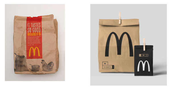
We believe that the mature and signature look we created is striking and could translate well into the digital space. A cohesive link between the digital and physical world would make it easy for the customers to recognise the brand.
As part of our exercise, we sat down with a brew and soon began to wonder how the UK’s largest tea provider would look if it decided to appeal to a more sophisticated market.
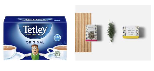
We decided that a more heritage feeling could stand out online; the Japanese print hinted at the origins of tea. The earthy tones that we chose would be easy to carry over into the digital space too.
A similar approach guided our rebranding of Lynx. We tried to envision what the brand may look like if it decided to go from cheap body products to high-end and sophisticated products.

Our redesign maintained a masculine aura, while the additional spacing within the logo creates a more premium feel. The colour combinations are more distinct too, creating a mature and musky feel.
Most people who have flown with Ryanair have had their own set of issues, but the airline continues to grow because of the great value it offers. However, affordable products doesn’t mean that the brand has to look cheap.
In this example, we created a rebrand that removes the negative feelings around flying with a low-budget airline. More vibrant colours would appeal to a younger and style-conscious audience. Our redesign was also practical, creating a hierarchy of importance to help passengers and airline staff identify the data they need at a glance.
KFC is another leading fast food brand in the UK. Its chicken is adored throughout the country, but its existing packaging is a little garish and hints at low-quality products rather than gourmet chicken that could come from a local butcher.
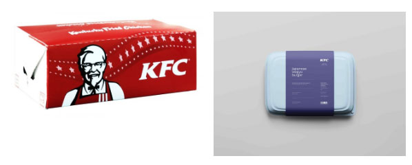
The subtle blue tones that we created offer an inviting feeling and cultivate a sense of calm (rather than urgency and speed that the red creates). This classier option would give consumers a much more inviting and pleasant experience.
Heinz is, for many people, the only ketchup out there. The brand has firmly etched itself into the common consciousness and its products have a sentimental appeal. The modern plastic bottles are not as iconic, though – what would Heinz ketchup look like if the brand decided to upgrade their packaging?
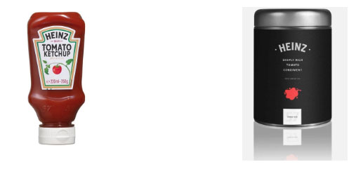
In this option, we decided to get rid of the plastic given that it’s often associated with cheaper products. This metallic chrome adds an air of sophistication and originality, while the splash of red hints at the delicious contents inside.
The beer brewing industry is a pretty competitive space.. The differences between many of the most common brands are negligible, so marketing and branding can make or break a brand. Heineken certainly rocks its branding, but what if it decided to declutter its packaging?
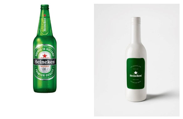
This upgrade uses simplicity and minimalism to transform the look and feel of the brand while retaining its iconic colours. Our option would help Heineken to differentiate itself from the competition in a crowded space while drawing attention to its iconic colours.
How Does Your Branding Help or Hinder Your Digital Marketing?
Have you tried everything, but your digital marketing results are still disappointing? Your branding might be letting you down. We recommend that you dedicate some time to really think about how your brand is reflected online and the changes you can make to create a brand that is as consistent and recognizable as possible.
what do you think?