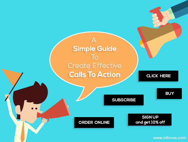
A Simple Guide To Create Effective Call To Action
We all want to make the landing pages look nice and persuasive, all at the same time.
While adding attractive images to attract users, adding testimonials can build up trust. They both contribute immensely to the success of any website.
Apart from these two important aspects, there is one more thing that you need on the website that is responsible for getting conversions. And that is Call to Action. You cannot make even a single conversion without an appropriate CTA on the page.
That is the reason why a CTA demands time and creativity. If you are looking to come up with some effective call to action buttons, these tips can help you go a long way.
1. Present as a first person
One of the best ways is to use possessive determiners on the CTA buttons. The different possessive determiners we use are: My, her, his, our, your, their, and its.
We have been taught to use ‘you’ to address readers to make them feel that we are talking to them directly. Keeping that in mind, make use of possessive terms in the calls to action. This will help your users understand the action they are precisely supposed to take.
2. Choose the right color
There always has been a debate over choosing the color of CTAs. The most frequently used colors for CTAs in the market are red and green. Some say red works better while others claim it is green. But the truth is that there is no color that can improve the conversion rates. It is simply stupid to think so. You, however, have to make sure that your call to action stands out in the crowd.
For example, if you go through the website of Salesforce, you will find that they have placed the calls to action in contrast colors at some places while at certain other places, you will find that background and call to action buttons are of the same color.
Now this is something that you must take care of. There are more chances of people missing on the CTAs in the second scenario.
So keep colors distinct from the background so that your buttons are easily visible for the users.
3. Keep it result oriented
Results convey a better message than just performing a task. So make sure to use them on your CTAs.
Say, for example, an SEO professional works to optimize a website. So, instead of saying he optimized landing pages of a website, it would be better to say that he optimized the landing pages and increased conversion by 8%.
Similarly, make convincing CTAs to catch the users’ attention. Instead of what you claim to offer, focus on what they can get from it. While using “Click”, “Order”, “Buy”, etc, show your confidence in your claims, going for alternatives such as “Get” can offer answers for the prospects’ questions.
Using powerful words, placing buttons at the right place and, most importantly, making them clickable is crucial for conversions.
4. Offer a bit more
Call to action buttons have to be compelling. They have to encourage the users to click on it. For this, offer some sweet deals or discount or even a chance to win a gift along with the call to action. For example:
- Sign up and get 10% off on your purchase
- Join us and get product updates free
5. Limit the number of calls to action
Too many call to action buttons on a page may baffle the users. It is like offering the users with different varieties of a product and confusing them. That way, the users may end up buying nothing.
Lesser calls to action means lesser choices and lesser efforts for the users. Although the right number of calls to action may vary from site to site, try to keep the number to the lowest.
Certain websites are confusing for the users. Some have call to action buttons saying both “Buy Now” and “Sign Up”. The users are left wondering what they should do first, sign up or buy the product or services. Thus it is better if your site shows the “Buy Now” option later, once a user has signed up.
6. Keep it urgent
Make sure your users know what you intend them to do through the call to action. Make use of active words such as:
- Buy
- Donate
- Call
- Subscribe
- Register
To create urgency in them compel users, you can make them forceful by saying:
- Order now
- Limited time offer
- Offer expires on Jan 31st
7. Find the right place
Another important factor about calls to action is to find the right position on the page. It would be better to place them in the center position, high on the page.
8. Clear up the spot
Not just the position of a call to action, but the space around it also matters. To make the call to action clearly visible, you should clear out the area around the button. The more clutter free the button is, the more attention it will draw from the users.
9. Make it large
Sometimes we are asked by the clients to make their website elements look large. It is true that designers fail to understand that and get annoyed. But let me tell you that big things attract users. If you take a peek at the Mozilla website, you will find the same things applied there.
10. Every page should have a call to action
Plan a call to action not just for the Home page, but for every page on your website. Calls to action must help users get things done besides leading them from one page to another as well as help. If the user reaches a dead-end without getting a solution to his problem, chances are that he will leave your website without buying anything.
Always keep in mind that you may not get the expected conversion rates if you fail to design the correct call to action buttons.
So create an amazing call to action on your landing pages and enjoy conversions like never before!!!


what do you think?